Table of Contents
So, you're thinking about getting inked? Awesome! But before you dive headfirst into the world of needles and vibrant colors, let's talk about what makes a good tattoo design. It's more than just picking a cool image; it's about creating a piece of art that flows with your body, tells your story, and stands the test of time. A truly great tattoo is a blend of artistic skill, personal meaning, and a solid understanding of how ink interacts with skin.
Understanding the Core Principles of Tattoo Design
Understanding the Core Principles of Tattoo Design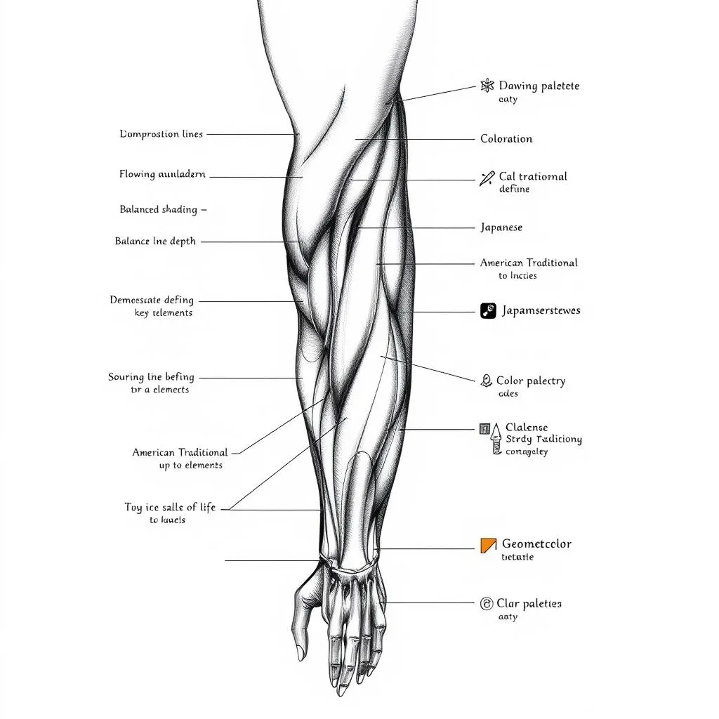
At its heart, understanding the core principles of tattoo design is about creating a visually compelling image that works harmoniously with the human form. It's not just about slapping a picture onto skin; it's about considering how that image will look as the body moves, ages, and changes over time. Think of it as designing a wearable piece of art, where the body is the canvas. This means understanding elements like composition, balance, and contrast, and how they all play together to create a cohesive and lasting design. It also means thinking about the technical aspects of tattooing: line weight, shading, and color choices, and how these will translate onto the skin. A solid grasp of these principles is what separates a memorable tattoo from one that fades into obscurity.
Before you even start sketching, spend some time researching different tattoo styles. Are you drawn to the bold lines and classic imagery of American Traditional? Or maybe the intricate details and realism of Japanese tattoos? Understanding the nuances of different styles will give you a framework for your own designs. It's like learning the rules of grammar before writing a novel. Once you know the rules, you can start bending them to create something truly unique.
Consider the following elements when choosing a style:
- American Traditional: Bold lines, classic imagery, and limited color palettes.
- Japanese: Intricate designs, often featuring mythical creatures and natural elements.
- Realism: Highly detailed and lifelike depictions of people, animals, or objects.
- Geometric: Clean lines, geometric shapes, and symmetrical patterns.
- Watercolor: Soft, flowing colors that mimic the look of watercolor paintings.
Elements of a Good Tattoo Design: Balance, Flow, and Composition
Elements of a Good Tattoo Design: Balance, Flow, and Composition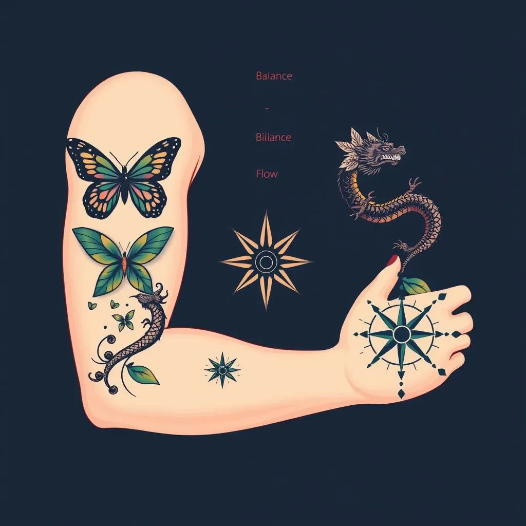
Visual Harmony: Achieving Balance in Tattoo Design
so you've got your style down. Now, let's talk about the real meat and potatoes of elements of a good tattoo design: balance, flow, and composition. Balance isn't just about symmetry (though that can be cool too!). It's about creating a visual equilibrium that's pleasing to the eye. Think about it like this: if you're doing a large piece on your back, you wouldn't want all the heavy elements clustered on one side, right? That would look lopsided and weird. Instead, you want to distribute the visual weight evenly, using shapes, colors, and negative space to create a sense of harmony.
There are two main types of balance: symmetrical and asymmetrical. Symmetrical balance is when both sides of the design are mirror images of each other. Think of a butterfly or a heart. Asymmetrical balance, on the other hand, is when the sides are different but still create a sense of equilibrium. This is a bit trickier to pull off, but it can be super effective. Imagine a design with a large flower on one side and a cluster of smaller leaves on the other. The flower is visually heavier, but the leaves help to balance it out.
The Dance of Ink: Flow and Composition in Tattoo Art
Next up is flow. This is all about how the design moves with the contours of your body. A good tattoo should enhance your natural shape, not fight against it. Think about the placement of the tattoo and how it will look when you move. Will it stretch or distort in awkward ways? Will it wrap around your curves in a flattering manner? This is where understanding anatomy comes in handy. Knowing how muscles and bones are structured beneath the skin will help you create a design that flows seamlessly with your body.
Composition is the overall arrangement of elements within the tattoo. It's how you organize shapes, lines, and colors to create a unified and visually interesting piece. A good composition will have a focal point, a clear hierarchy of elements, and a sense of depth. Think about how you want the viewer's eye to move through the design. Do you want them to be drawn to a particular area first? How will you guide their gaze through the rest of the tattoo? These are all important considerations when planning your composition.
Element | Description | Example |
|---|---|---|
Balance | Visual equilibrium in the design. | Symmetrical butterfly, asymmetrical flower and leaves. |
Flow | How the design moves with the body's contours. | A dragon wrapping around an arm, following the muscle lines. |
Composition | Overall arrangement of elements. | Focal point, clear hierarchy, sense of depth. |
Color Theory and Longevity: How They Impact Your Tattoo Design
Color Theory and Longevity: How They Impact Your Tattoo Design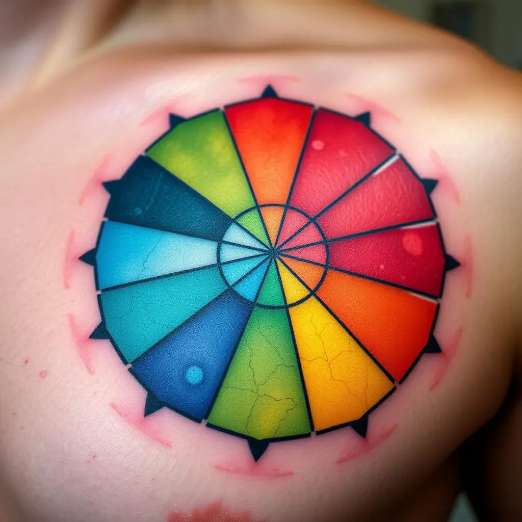
The Rainbow Connection: Understanding Color Theory for Tattoos
Alright, let's get colorful! Color theory and longevity: how they impact your tattoo design is a seriously important topic. When it comes to tattoos, it's not just about picking your favorite hues. You've got to understand how colors interact with each other, how they'll look against your skin tone, and most importantly, how they'll hold up over time. Think of it like this: you're not just painting on a canvas; you're injecting pigment into a living, breathing organ. That means the colors are going to change and fade over the years, so you need to choose wisely.
First things first, let's talk about the color wheel. Understanding primary, secondary, and tertiary colors is crucial for creating harmonious and visually appealing designs. Complementary colors (those opposite each other on the wheel) create high contrast and can make your tattoo pop. Analogous colors (those next to each other) create a more subtle and harmonious effect. And don't forget about saturation and value! These factors will affect how vibrant and eye-catching your tattoo will be.
Fade to Gray? Color Choices and Tattoo Longevity
Now, let's get real about longevity. Not all colors are created equal when it comes to tattoos. Some pigments are more stable and fade-resistant than others. Darker colors, like black and dark blue, tend to hold up better over time than lighter colors, like yellow and pastel shades. This is because darker pigments have a higher concentration of particles, making them less likely to break down and fade.
Also, consider the placement of your tattoo. Areas that are exposed to a lot of sunlight, like your hands and neck, are more prone to fading. If you're planning a colorful tattoo in one of these areas, be extra diligent about sun protection. Sunscreen is your best friend! Also, moisturizing regularly will help keep your skin healthy and prevent the tattoo from drying out and cracking.
Color | Longevity | Notes |
|---|---|---|
Black | Excellent | Most stable and long-lasting color. |
Dark Blue | Very Good | Holds up well, especially in traditional styles. |
Red | Good to Fair | Can fade over time, especially if exposed to sunlight. |
Yellow | Poor | Most prone to fading, requires touch-ups. |
Beyond the Basics: Special Effects and Color Considerations
Want to get fancy? Let's talk about special effects. Techniques like watercolor and gradients can create stunning visual effects, but they also require a deep understanding of color theory and how pigments blend together. Watercolor tattoos, for example, rely on soft, diluted colors that mimic the look of watercolor paintings. These tattoos can be beautiful, but they also tend to fade more quickly than traditional tattoos, as the pigment is less concentrated.
Gradients, on the other hand, involve blending two or more colors together to create a smooth transition. This technique can add depth and dimension to your tattoo, but it also requires careful planning to ensure that the colors blend seamlessly and don't create muddy or undesirable hues. When in doubt, consult with your tattoo artist. They can help you choose the right colors and techniques to achieve your desired look while maximizing the longevity of your tattoo.
Adapting Tattoo Designs to Body Placement and Movement
Adapting Tattoo Designs to Body Placement and Movement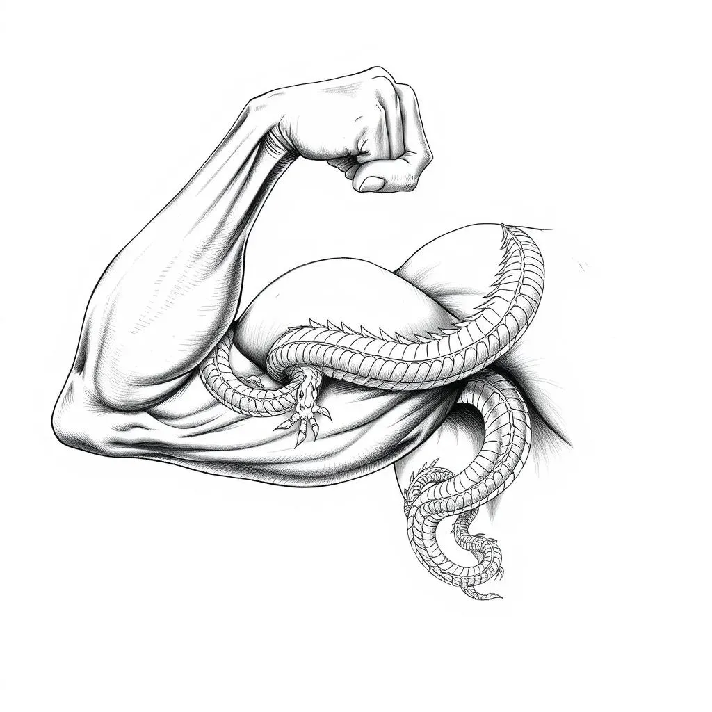
so you've got this killer design in mind, but hold up! Before you commit, let's talk about adapting tattoo designs to body placement and movement. This is crucial because a tattoo that looks amazing on paper might not translate well onto your skin if you don't consider the contours and movement of your body. Think of your body as a living, breathing canvas that's constantly changing shape. Your tattoo needs to work with that, not against it. We're talking about creating a cohesive piece of art that flows seamlessly with your natural curves and muscle lines.
First things first, consider the size and shape of the design in relation to the body part you're tattooing. A small, intricate design might get lost on a large area like your back, while a large, bold design might overwhelm a smaller area like your wrist. Think about the overall composition and how it will look from different angles. Will it stretch or distort when you move? Will it wrap around your curves in a flattering way? These are all important questions to ask before you commit to a design.
Placement is everything. A design that looks great on your arm might not work as well on your ribs. Certain body parts are more prone to stretching and distortion, which can affect the appearance of your tattoo over time. Areas like your stomach, thighs, and upper arms are more likely to change shape as you gain or lose weight, so it's important to choose designs that can accommodate these changes. On the other hand, areas like your ankles, wrists, and collarbones tend to be more stable, making them ideal for smaller, more intricate designs.
Movement is another key factor to consider. Think about how your muscles move when you flex or extend your limbs. A tattoo that crosses a major muscle group might distort in awkward ways when you move, so it's important to choose designs that flow with the natural movement of your body. For example, a dragon wrapping around your arm can look amazing when your arm is relaxed, but it might look strange when you flex your bicep. By understanding how your muscles move, you can create a tattoo that looks dynamic and visually appealing from every angle.
Body Part | Design Considerations | Example |
|---|---|---|
Back | Large, expansive designs that flow with the spine. | A phoenix with wings that stretch across the shoulders. |
Arm | Designs that wrap around the muscles and follow the natural contours. | A dragon coiling around the bicep. |
Ribs | Designs that are flexible and can accommodate movement and breathing. | A flowing script or a delicate floral pattern. |
Ankle/Wrist | Small, intricate designs that won't be distorted by movement. | A geometric symbol or a small animal. |
Avoiding Common Pitfalls in Tattoo Design and Ensuring a Timeless Piece
Avoiding Common Pitfalls in Tattoo Design and Ensuring a Timeless Piece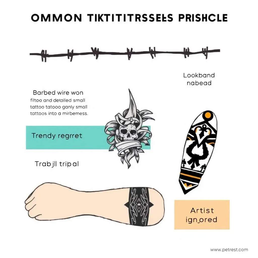
#1: The "Trendy Today, Regretted Tomorrow" Trap
Alright, let's get real about avoiding common pitfalls in tattoo design and ensuring a timeless piece. You know that barbed wire around the bicep that was all the rage in the '90s? Or that tribal armband that everyone seemed to have in the early 2000s? Yeah, those are prime examples of what *not* to do. Trends come and go, but tattoos are (usually) forever. So, steer clear of anything that's super trendy at the moment. Instead, opt for designs that have a timeless quality, something that will still look cool and meaningful years down the road.
Think about it like this: you wouldn't want to decorate your house with the latest fad, right? You'd want to choose furniture and decor that reflects your personal style and will stand the test of time. The same goes for tattoos. Choose designs that resonate with you on a deeper level, something that reflects your values, passions, or experiences. That way, you'll be less likely to regret it later.
#2: The "Too Much Detail in a Small Space" Disaster
This is a big one! Trying to cram too much detail into a small tattoo is a recipe for disaster. Over time, the ink will spread and blur, turning your intricate masterpiece into an unreadable mess. Think about it like trying to paint a miniature portrait on a grain of rice. It's just not going to work! Instead, simplify your design and focus on the essential elements. Use bold lines and negative space to create a clear and legible image that will hold up over time.
Remember, less is often more. A simple, well-executed design will always look better than a cluttered, over-complicated one. If you're set on a highly detailed design, consider getting it done on a larger area of your body, where there's more room for the ink to breathe. And always, always consult with your tattoo artist. They can advise you on the best way to scale your design and ensure that it will look great for years to come.
Pitfall | Description | Solution |
|---|---|---|
Trendy Designs | Choosing designs that are popular at the moment but may not age well. | Opt for timeless designs that reflect your personal style and values. |
Too Much Detail | Trying to cram too much detail into a small tattoo. | Simplify the design or choose a larger area of the body. |
Poor Placement | Placing a tattoo on a body part that is prone to stretching or distortion. | Choose a more stable area of the body or adapt the design to accommodate movement. |
#3: The "Ignoring the Artist's Expertise" Faux Pas
You've found an artist whose style you love, you've got a design in mind... awesome! But don't make the mistake of thinking you know more than they do. A good tattoo artist is a skilled professional with years of experience. They know what works and what doesn't, and they can offer valuable insights on everything from design to placement to color choices. So, be open to their suggestions and trust their expertise.
Think of it like going to a doctor. You wouldn't ignore their medical advice, right? The same goes for tattoos. Your artist is the expert, so listen to what they have to say. They might suggest tweaking your design to make it more tattoo-friendly, or they might recommend a different placement that will look better on your body. Ultimately, the goal is to create a tattoo that you'll love for years to come, and that requires a collaborative effort between you and your artist.
Crafting Your Mark: The Art of a Timeless Tattoo Design
Ultimately, what makes a good tattoo design is a combination of artistry, personal significance, and thoughtful execution. It's about understanding the principles of design, respecting the canvas of your body, and choosing an artist who can bring your vision to life. By considering the elements we've discussed – balance, flow, color, placement, and longevity – you'll be well-equipped to create a tattoo that not only looks amazing today but will continue to tell your story beautifully for years to come. So, go forth, explore your creativity, and wear your ink with pride!