Table of Contents
So, you're thinking about getting some ink, and words are calling your name. Maybe it's a name, a date, a quote that hits you right in the gut, or just a single powerful word. It sounds simple, right? Just pick the letters and get them zapped on. If only it were that easy. Choosing the right tattoo designs letters is actually a pretty big deal. The font, the size, the placement – it all changes the message and the vibe entirely. A dainty script feels way different than bold, blocky text. Mess it up, and that meaningful phrase might just look like a blurry mess in a few years. This guide isn't just about showing you pretty pictures. We're going to dig into why people choose lettering in the first place, break down the popular styles you see out there, tackle the surprisingly tricky task of picking the perfect font, and give you solid advice on making sure your lettered tattoo looks killer for the long haul. Stick around, and let's talk about making your words count.
Why Lettering Tattoos? More Than Just Words
Why Lettering Tattoos? More Than Just Words
Words Carry Weight, Literally
Look, we live in a world flooded with images. But sometimes, an image just doesn't cut it. Sometimes, you need the raw power of words. That's where tattoo designs letters come in. People get lettering tattoos because words hold specific, undeniable meaning. They aren't open to interpretation in the same way a picture might be. A name is a name. A date is a date. A quote is that exact string of thoughts that resonated so deeply with you, it felt like it was written just for your soul. It's about putting something concrete, something you can read and repeat, onto your skin forever. It's a constant reminder, a personal mantra, or a tribute etched right there.
Making a Bold (or Subtle) Statement
Beyond the deep personal meaning, lettering tattoos are also a deliberate visual choice. The style of the lettering itself says something before you even read the words. Think about it: a thick, Gothic script feels heavy and serious, maybe a bit rebellious. A delicate, flowing cursive feels elegant and perhaps more private. Block letters are direct and strong. The font you pick is just as important as the words themselves in conveying the message. It's not just ink; it's typography on skin, a design element that can be incredibly striking or subtly beautiful, depending on how it's handled. It's a way to wear your philosophy, your history, or your loyalties right on your sleeve, or anywhere else for that matter.
Permanence in a Fleeting World
Committing words to your skin is a significant act. In a world where thoughts and feelings change constantly, a lettering tattoo is a statement of permanence. It says, "This idea, this name, this date matters enough to me that I want it with me always." It's a anchor in the often-turbulent sea of life. It requires careful consideration, not just of the words themselves, but of the tattoo designs letters style that will represent them for decades. Because unlike a favorite shirt or a piece of jewelry, you can't just take it off when you change your mind. It’s a commitment to a piece of yourself, expressed through language.
Exploring Popular Tattoo Designs Letters Styles
Exploring Popular Tattoo Designs Letters Styles
Alright, so you've decided words are the way to go. Now comes the fun part, and honestly, where things can get a little overwhelming: the styles. When we talk about tattoo designs letters, it's not just about picking Times New Roman or Arial. There's a whole universe out there. You've got everything from the classic, flowing script that looks like it was written with a fancy quill, to bold, geometric block letters that scream modern art. Then there's the gritty, almost handwritten look, or maybe something intricate and calligraphic that feels ancient and wise. Each style completely changes how those words land. A simple name in elegant script feels intimate; the same name in sharp, angular gothic text feels dramatic, maybe even a bit intimidating. It's about finding the visual language that matches the emotional weight of your chosen words.
Choosing the Perfect Font for Your Tattoo Designs Letters
Choosing the Perfect Font for Your Tattoo Designs Letters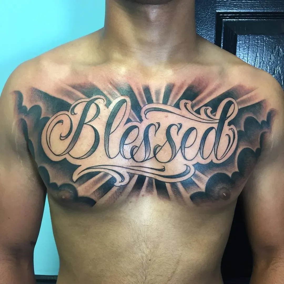
Why Picking a Font Isn't Just Point and Click
so you've got the words locked down. Great. Now for the part that trips up more people than they'll admit: the font. This isn't like picking Arial for your resume. Tattoo designs letters aren't just static text on a screen; they live on your skin, which moves, stretches, and ages. A font that looks crisp and clear at size 12 on your computer might turn into an illegible blob or a jagged mess when tattooed, especially in smaller sizes or tricky spots. Skin isn't paper. It has texture, it has pores, and ink spreads over time, a lovely process tattooers call "blowout." So, that super intricate, delicate script you fell in love with online? It might be beautiful on paper, but on skin, it could look muddy and lose definition faster than you lose socks in the dryer. You need a font built for permanence, not just pretty aesthetics.
Where to Look (and What to Watch Out For)
The internet is a rabbit hole of fonts, and yes, you can find tons of "tattoo fonts." But be wary. Many are designed purely for graphics and don't translate well to skin. Your best bet? Look at actual examples of healed lettering tattoos. See how different fonts hold up over time on different skin types and body parts. Talk to your tattoo artist – a good one has seen it all and knows which fonts are nightmares to tattoo and which ones have staying power. They can often tweak existing fonts or even hand-draw something unique that's designed specifically to work with the flow and limitations of tattooing. Don't just download the first cool font you see and demand it. Think about readability from a distance, how the letters connect (or don't), and whether those fine lines are actually going to stay fine lines.
- Consider readability: Can you still read it in 10 years?
- Think about placement: A font for a ribcage might differ from one for a forearm.
- Ask your artist: They have practical experience with ink on skin.
- Look at healed work: See how different fonts look over time, not just fresh.
- Avoid overly thin or complex fonts for small pieces.
- Understand the style: Does the font match the *feeling* of the words?
Tips for Getting and Caring for Lettering Tattoos
Tips for Getting and Caring for Lettering Tattoos
Tips for Getting and Caring for Lettering Tattoos
Alright, you've agonized over the words, debated fonts, and finally sat in the chair. Getting the tattoo is only half the battle, maybe less. The real work starts when you walk out the door with your fresh tattoo designs letters wrapped up. First off, listen to your artist. Seriously. If they tell you that super-fine line script isn't going to hold up on your elbow because of skin movement, believe them. They've seen letter tattoos turn into blurry messes because someone insisted on fighting physics. Placement matters hugely for how letters age. Once it's on your skin, caring for your new ink is non-negotiable if you want those words to remain legible and sharp for years, not just months. This means diligent washing with plain soap, gentle moisturizing with recommended lotion, and absolutely, positively keeping it out of direct sun while it heals and ideally forever after. Think of it like a tiny, permanent book on your skin; you wouldn't leave your favorite novel out in the rain, would you?
Making Your Mark: Final Thoughts on Lettering
Getting tattoo designs letters isn't a decision to take lightly. It's putting permanent words on your body, a visual statement that sticks around. We've looked at why people choose words, the sheer variety of styles available, and the critical step of font selection. Remember, what looks cool on a screen might not translate well to skin, especially over time. The right artist, the right placement, and solid aftercare are just as crucial as the design itself. Your words, your message – they deserve the thought and attention needed to ensure they remain clear, impactful, and something you're genuinely happy to carry with you.