Table of Contents
Ever wondered how a simple idea transforms into a stunning tattoo? The process of tattoo design is a captivating blend of artistry, technical skill, and understanding the canvas – the human body. It's more than just drawing; it's about creating a lasting piece of art that resonates with the wearer. So, how does tattoo design work? This article will guide you through the essential elements, from gathering inspiration and mastering design techniques to understanding the crucial rules that ensure a tattoo looks incredible and stands the test of time. Whether you're an aspiring artist or simply curious about the process, we'll explore the importance of reference photos, color palettes, and the choice between hand-drawing and digital methods. We'll also delve into design principles like contrast, negative space, and how to consider skin tone and tattoo placement. By the end, you'll have a solid understanding of what it takes to create a truly remarkable tattoo.
Reference Photos and Color Palettes in Tattoo Design
Reference Photos and Color Palettes in Tattoo Design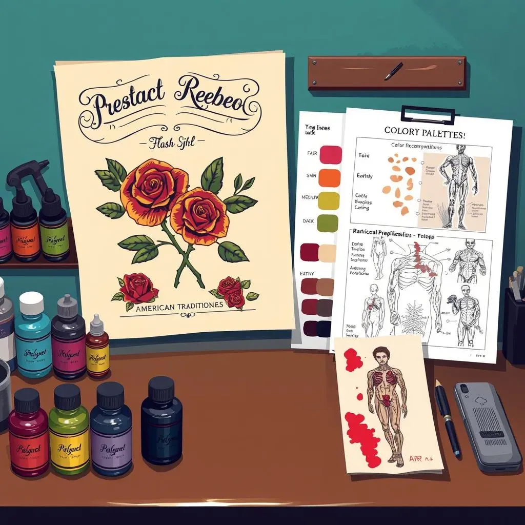
Finding Your Muse: The Power of Reference Photos
Think of reference photos as your North Star in the tattoo design process. They aren't about copying; they're about understanding. If you're aiming for an American Traditional rose, don't just stare at any rose. Dive into vintage tattoo flash sheets, analyze the linework, the shading, and how the colors pop. Pinterest is your friend here, but also explore copyright-free photography sites for unique perspectives. Remember, the goal is to inform your design, not replicate someone else's work. I once spent hours poring over old anatomical drawings for a biomechanical tattoo, and it completely transformed the final piece!
"Good artists copy, great artists steal." - Pablo Picasso (though in tattooing, we heavily emphasize "transform" rather than "steal")
Color Stories: Building Your Palette
Color can make or break a tattoo. Are you going for bold and vibrant, or subtle and muted? Consider the tattoo style. American Traditional screams for primary colors, while realism might demand a more nuanced, earthy palette. Think about the client's skin tone, too. Colors look different on different complexions. Darker skin can handle bolder pigments, while lighter skin might need softer shades to avoid a washed-out look. Don't be afraid to experiment with color combinations in your design software before committing to ink.
Skin Tone | Recommended Colors | Colors to Approach with Caution |
|---|---|---|
Fair | Pastels, light blues, greens, reds | Dark browns, blacks (can appear heavy) |
Medium | Most colors work well, especially jewel tones | Very light yellows (can look faded) |
Dark | Bright, saturated colors, neon hues | Pale shades (may not show up well) |
From Inspiration to Creation: Avoiding the Copycat
It's tempting to directly trace a reference photo, especially when you're starting out. Resist that urge! Instead, use the photo as a guide to understand the subject's form, lighting, and texture. Break down the image into basic shapes and rebuild it in your own style. Change the pose, add different elements, or combine multiple references to create something truly original. This is where your artistic voice comes in. It's the difference between being a tattoo artist and a tattoo copier. And trust me, clients can tell the difference.
What are your favorite resources for finding tattoo inspiration?
HandDrawing vs. Digital Tattoo Design Techniques
HandDrawing vs. Digital Tattoo Design Techniques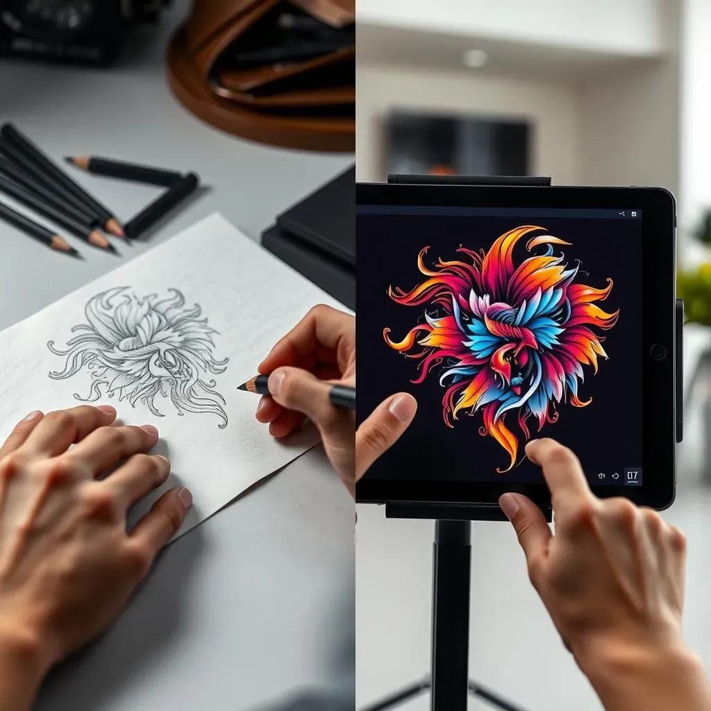
The Old School Charm: Hand-Drawing Techniques
There's a certain romance to hand-drawing tattoo designs. It's tactile, immediate, and allows for a direct connection between your mind and the paper. Start with light sketches to map out the basic shapes and composition. Gradually build up the details, using different pencil grades to create depth and shading. Don't be afraid to make mistakes! That's part of the process. Invest in good quality paper and pencils, and practice different line weights to achieve a professional look. I still sketch out most of my designs by hand, even if I later refine them digitally. There's just something about the feel of pencil on paper that sparks creativity.
Hand-drawing offers unique control over line weight and texture. Experiment with different techniques like stippling, hatching, and cross-hatching to add depth and visual interest to your designs. Consider using tracing paper to refine your sketches and create clean linework for stencils. This allows for easy transfer of your design onto the client's skin.
The Digital Revolution: Designing with Pixels
Digital tattoo design has exploded in popularity, and for good reason. Software like Procreate and Adobe Photoshop offer incredible flexibility, precision, and the ability to easily make changes. Designing in layers is key. This allows you to separate the linework, shading, and colors, making it easy to adjust each element independently. Learn to use digital brushes to mimic the look and feel of traditional drawing techniques. Experiment with different blending modes to create unique effects. And most importantly, don't be afraid to undo! Digital design is all about experimentation and refinement.
Digital tools offer unparalleled precision and efficiency. Utilize features like symmetry guides and perspective grids to create perfectly balanced and technically accurate designs. Consider investing in a good quality stylus and drawing tablet for a more natural drawing experience. Cloud storage and version control ensures your designs are safe and accessible across multiple devices.
Technique | Pros | Cons |
|---|---|---|
Hand-Drawing | Tactile, direct connection, unique textures | Less precise, harder to edit, requires physical materials |
Digital Design | Precise, easy to edit, versatile, cloud storage | Can feel less organic, requires software and hardware, learning curve |
Essential Tattoo Design Rules and Considerations
Essential Tattoo Design Rules and Considerations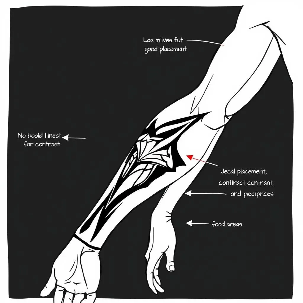
The Canvas Speaks: Understanding Placement and Flow
A killer design can look awful if it's slapped on the wrong body part. Consider the client's anatomy. A design that flows with the muscles looks far better than one that fights against them. Think about how the tattoo will move as the person moves. Will it stretch and distort in awkward ways? Talk to your client about their lifestyle and how the tattoo might be affected by their daily activities. A tattoo on the elbow might not be the best choice for a rock climber, for example. Placement is just as important as the design itself.
Consider the natural curves and contours of the body. Tattoos placed on flat surfaces tend to appear static and lifeless. Opt for areas where the design can wrap and flow organically. Discuss the client's clothing preferences and how the tattoo will be visible in different outfits. A well-placed tattoo can enhance the body's natural beauty and create a stunning visual impact.
Contrast is King: Ensuring Legibility and Longevity
Contrast is what makes a tattoo pop and ensures it will still look good years down the line. High contrast designs, with bold lines and strong shading, tend to hold up better over time than delicate, low-contrast designs. Think about how the colors will fade over time. Darker colors tend to last longer than lighter colors. Use black strategically to outline and define the key elements of your design. This will help to prevent the tattoo from blurring and fading into the skin. A little contrast goes a long way in creating a tattoo that will stand the test of time.
Utilize a variety of line weights to create visual interest and hierarchy. Thicker lines define the outer edges of the design, while thinner lines add detail and texture. Incorporate negative space to create contrast and prevent the design from appearing too cluttered. Consider the client's skin tone when choosing colors. High contrast color combinations work best on lighter skin tones, while more subtle contrasts may be necessary on darker skin tones.
Element | Importance | Considerations |
|---|---|---|
Placement | Flow with anatomy | Movement, stretching, lifestyle |
Contrast | Legibility, longevity | Line weight, shading, color choices |
Negative Space | Clarity, visual balance | Preventing clutter, allowing skin to breathe |
Leave Some Room to Breathe: The Power of Negative Space
Negative space, or "skin breaks," is the empty space around and within your design. It's just as important as the inked areas. Too much ink crammed into a small space can create a muddy, illegible mess. Negative space allows the eye to rest and helps to define the individual elements of the design. It also allows the skin to breathe, which can aid in the healing process. Think of negative space as the white space in a magazine layout. It's what makes the text and images easy to read and understand.
Strategically use negative space to highlight key features and create visual balance. Avoid filling every available space with ink. Allow the skin to peek through and create contrast. Consider the overall composition of the tattoo and how the negative space contributes to the design's flow and movement. A well-balanced design with ample negative space will appear cleaner, more refined, and more visually appealing.
What are some common mistakes you see in tattoo designs, and how can they be avoided?
The Art of Ink: Mastering Tattoo Design
Understanding how tattoo design works is a journey that blends creativity with technical know-how. From the initial spark of inspiration to the final inked masterpiece, every step requires careful consideration. Whether you choose the traditional route of hand-drawing or embrace the precision of digital tools, the principles of contrast, color, and composition remain paramount. By respecting the canvas of the human body and considering factors like skin tone and placement, you can create tattoos that are not only visually stunning but also enduring works of art. So, embrace the process, hone your skills, and leave your mark on the world, one tattoo at a time.